
Business & Tech Essentials
How to Create a Timeline in Power BI
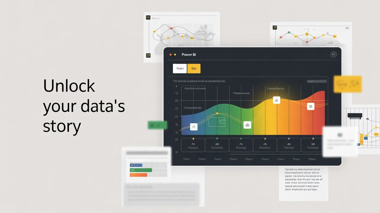
Power BI has become one of the most powerful data visualization tools for businesses across the globe. With its ability to connect, analyze, and visualize data in interactive ways, Power BI allows organizations to turn raw information into meaningful insights. Among its many features, the Power BI timeline is one of the most useful visuals, enabling users to track events, monitor progress, and analyze data trends over a specific period. Whether you’re handling project milestones, sales cycles, or HR records, timelines in Power BI bring clarity to data storytelling.
When organizations adopt Microsoft Power BI services, they gain access to advanced visualization capabilities, real-time dashboards, and interactive reporting tools that drive smarter business decisions. In 2026, creating timelines has become even more streamlined with AI-powered features like Copilot, which allows you to build complex timeline visuals using simple natural language commands.
Creating a timeline in Power BI is a simple yet impactful way to communicate chronological data effectively, making it valuable for both beginners and experienced analysts. With new collaboration tools like PBIR format and Git integration, teams can now work together on timeline reports more efficiently than ever before.
What is a Power BI Timeline?
A Power BI timeline is a custom visual or chart that represents data over time. It allows users to display sequences of events in a chronological order, making it easier to identify patterns, spot anomalies, and track progress. Unlike traditional charts, timelines provide a linear flow of information, which is especially useful in project management, business analysis, and performance monitoring.
With Power BI timeline charts, you can:
-
Show important dates such as product launches, employee onboarding, or project deadlines.
-
Track performance metrics over time.
-
Compare different time periods such as monthly, quarterly, or yearly results.
-
Present historical trends alongside future projections.
This makes the timeline visual in Power BI a go-to feature for professionals who want to make time-based data easy to understand.
Why Use a Power BI Timeline?
Many businesses rely on tables, bar charts, or pie charts to present data, but these visuals often fail to convey the chronological aspect of information. A timeline chart fills this gap by:
-
Highlighting sequential data: Perfect for event tracking and project updates.
-
Simplifying analysis: Converts complex datasets into easy-to-read flows.
-
Making reports more interactive: Allows drill-throughs, filters, and dynamic exploration.
-
Improving decision-making: Clear visibility of time-based trends enables informed strategies.
For example, an HR manager can use a Power BI timeline to track employee hiring trends year by year, while a sales team can use it to visualize customer acquisition over time.
How to Create a Timeline in Power BI
Now, let’s go step by step on how to design a Power BI timeline chart for your reports and dashboards.
Step 1: Open Power BI Desktop
-
Launch Power BI Desktop and connect it to your dataset.
-
Ensure your dataset includes a date column (such as project start date, order date, or event date).
Step 2: Import Specialist Timeline Visuals
-
Click the three dots (...) in the Visualizations pane and select “Get More Visuals.”
-
Recommendation 1: Search for the “Timeline Slicer” by Microsoft if you need a dedicated filtering tool.
-
Recommendation 2: Search for “Gantt Chart by MAQ Software” or the “Microsoft Gantt Chart” for project management and task dependencies.
Pro Tip: As a Microsoft partner, we recommend checking for the "Certified" badge on visuals to ensure they support PDF exporting and high-security standards.
Step 3: Map Your Data & Build the "Date Dim" Table
-
The Golden Rule: Never use the raw date from your sales or project table. Create a dedicated Date/Calendar table using DAX (CALENDARAUTO) to avoid gaps in your timeline.
Pro Tip: "If CALENDARAUTO() creates too many blank years, use the CALENDAR(DATE(2020,1,1), TODAY()) function instead to lock your timeline to a specific range."
-
Mapping: For a Gantt chart timeline, Drag your Date field into the Time bucket and your Project Phase or Event Name into the Category bucket. If you only have one date, the visual may default to a single point instead of a duration bar.
2026 Feature: If using the New Card Visual for milestones, you can now drag images directly into the "Image" field to show project leads or product icons right on the timeline bar.
Step 4: Customize the Timeline
-
Format your timeline by changing colors, fonts, and labels.
-
Enable zoom features for interactive navigation.
-
Add filters to drill down into specific time ranges.
Step 5: Publish and Share
-
Before publishing, check the Mobile Layout in Power BI Desktop to ensure your timeline slicer is touch-friendly for on-the-go reporting.
-
Once satisfied, publish your report to the Power BI service.
-
Share it with your team or embed it into dashboards for real-time tracking.
Watch: How to Create a Timeline in Power BI (Out2Sol Training Video)
What's New in Power BI Timelines for 2026
The way we build timelines in Power BI has evolved significantly. If you're creating or updating a timeline report this year, here are the key updates you need to know.
Modern Visuals for Better Timelines
-
New Card Visual: Now standard for displaying milestone information. Show project status, completion dates, and hero images in one clean card instead of multiple elements.
-
Azure Maps Required: If your timeline tracks location data (regional rollouts, multi-site projects), migrate from Bing Maps to Azure Maps before June 2026 when the old visual retires.
-
Smarter Slicers: Updated timeline slicers take up 40% less space while offering better date filtering. Perfect for dashboards that need more data in less room.
Copilot Makes Timeline Building Faster
Copilot has become essential for creating timelines quickly:
-
Natural Language Creation: Just describe what you want: "Show me project milestones vs actual completion for the last 12 months" and Copilot builds it.
-
Automatic DAX Writing: Complex calculations like rolling averages and period comparisons? Copilot handles the formulas for you in the DAX Query View.
Better Team Collaboration
-
PBIR Format: Default for all new reports since January 2026. Makes your timeline "code-friendly" and trackable.
-
Git Integration: Track every change, revert versions, and avoid file conflicts.
-
Simultaneous Editing: Multiple team members can work on the same timeline without blocking each other.
Important Feature Retirements
|
Feature |
Retirement Date |
What to Do |
|
Bing Maps |
June 2026 |
Switch to Azure Maps for map-based timelines |
|
Metric Sets |
Q1 2026 (Removed) |
Use Scorecards for timeline goals |
|
R & Python Visuals |
May 2026 |
Limited support for published reports |
|
Old Q&A Visual |
Replaced |
Use Copilot chat interface instead |
Types of Timeline Charts in Power BI
There are different ways to represent timelines depending on the nature of your data:
|
Timeline Type |
Best Use Case |
Key Advantage |
|
Standard Timeline |
Event sequences & history |
Simple, linear, and easy for stakeholders to read. |
|
Gantt Chart |
Project & Task management |
Shows dependencies (e.g., Task B cannot start until A is done). |
|
Milestone Card |
High-level executive views |
Uses the 2026 New Card Visual to show key dates with "Hero Images." |
|
Timeline Slicer |
Interactive Dashboard filtering |
Acts as a global filter for all other charts on the page. |
|
Azure Maps Timeline |
Regional rollouts & logistics |
Visualizes progress across geographical locations (Replaces Bing Maps). |
Each type of timeline visual in Power BI serves different purposes, giving flexibility to analysts and business users.
Use Cases for Power BI Timeline Charts
A Power BI timeline template can be applied across industries:
-
Project Management: Tracking tasks, deadlines, and dependencies.
-
Human Resources: Visualizing employee hiring, promotions, or training sessions.
-
Sales and Marketing: Mapping customer journeys, seasonal sales, or campaign effectiveness.
-
Healthcare: Monitoring patient records, treatment cycles, and appointments.
-
Education: Tracking academic schedules, student performance, and course progress.
These use cases show why timelines are among the most widely used visuals in Power BI.
Best Practices for Designing Timeline Visuals in Power BI
-
Keep the design simple and avoid clutter.
-
Use color coding for different categories.
-
Ensure proper scaling for time intervals.
-
Add tooltips for additional insights.
-
Use filters and slicers for interactivity.
By following these practices, you can create visually appealing and insightful timelines.
Common Timeline Troubleshooting
1. "Visual Has Exceeded Available Resources"
-
This happens when you try to plot too many data points (e.g., 5 years of daily data).
-
Solution: Use the Filter Pane to limit the view to the current year or use Aggregated Data (weeks instead of days).
2. Date Format/Locale Mismatch
-
If your timeline shows "January 8" instead of "August 1," your locale settings are likely mismatched.
-
Solution: Go to Transform Data, right-click your date column, and select Change Type > Using Locale to set it to your specific region (e.g., English - US).
3. Azure Maps Visual is Blank
-
As of 2026, old Bing Maps visuals are retiring.
-
Solution: You must manually migrate to the Azure Maps visual. Ensure your admin has enabled "Azure Maps" in the Fabric Admin Portal, or the visual will remain grayed out.
4. Git Merge Conflicts in Timelines
-
With the new PBIR format, multiple people might edit the same timeline.
-
Solution: Always "Pull" the latest version from your Git repository before making layout changes to the .pbir folder files to avoid overwriting a teammate's work.
Power BI Timeline vs Traditional Charts
While bar charts and line charts are widely used, a Power BI timeline stands out because it shows both sequence and duration. Traditional visuals often miss the chronological context, whereas timelines highlight the flow of events. This makes them ideal for business users who need clarity on “when” something happened, not just “what” happened.
Final Thought
The Power BI timeline is a powerful way to visualize data across time, providing valuable insights for businesses, educators, healthcare providers, and project managers. By using timeline charts, organizations can track progress, monitor events, and make smarter decisions. As part of Microsoft Power BI services, timeline visuals are becoming essential tools for anyone who wants to build interactive, engaging, and professional reports.
A Power BI timeline turns raw time-based data into a clear story, making it easier for businesses to track progress and plan for the future.
Disclaimer: All logos, trademarks, and brand names used in this document are the property of their respective owners. Their use here is for identification purposes only and does not imply endorsement.
Recent News
%20in%20Brief.webp)
AI (Artificial Intelligence) in Brief
08-04-2026

How to Post a Batch in Purchase Orders in D365 Business Central
06-04-2026

How to Manage User Permissions in a SharePoint Document Library
29-03-2026

Microsoft Power BI Gateway: A Professional Guide
16-03-2026

Benchmarking Discount Voucher Practices: 2026 Industry Guide
16-03-2026

Importance of Trademarking Your Logo (How to Start Today)
07-03-2026

Set Up Default Account Numbers for BC Sales Invoices
02-03-2026

Saudi PDPL Enforcement Updates & Data Privacy Guidelines
23-02-2026

Cyber Security Awareness and Compliance Guide for Organizations
07-02-2026

Microsoft PBVIZ Files: How to Import and Use Custom Power BI Visuals
21-01-2026

Your choice regarding cookies on this site
Policy, By Continuing, You are agreeing to Our Terms of Use and Consenting to the above.
Privacy Policy Powered By | ![]()


